
The Google Sheets SPARKLINE function turns a row or column of numbers into a tiny chart that lives inside a single cell. It shows you the trend at a glance, without a full chart floating over your sheet.
I use sparklines in almost every report I build. They make a dense table readable in seconds. In this guide, you’ll learn the basic formula, every chart type, the customization options that actually work, and how to fix the errors that trip most people up.
What Is a Sparkline in Google Sheets?
A sparkline is a small, word-sized chart that sits inside a cell. The idea comes from data visualization writer Edward Tufte, and you can read the background on Wikipedia’s sparkline page. Google Sheets brought the concept into spreadsheets through the SPARKLINE function, which is documented in Google’s official SPARKLINE help page.
How Sparklines Work
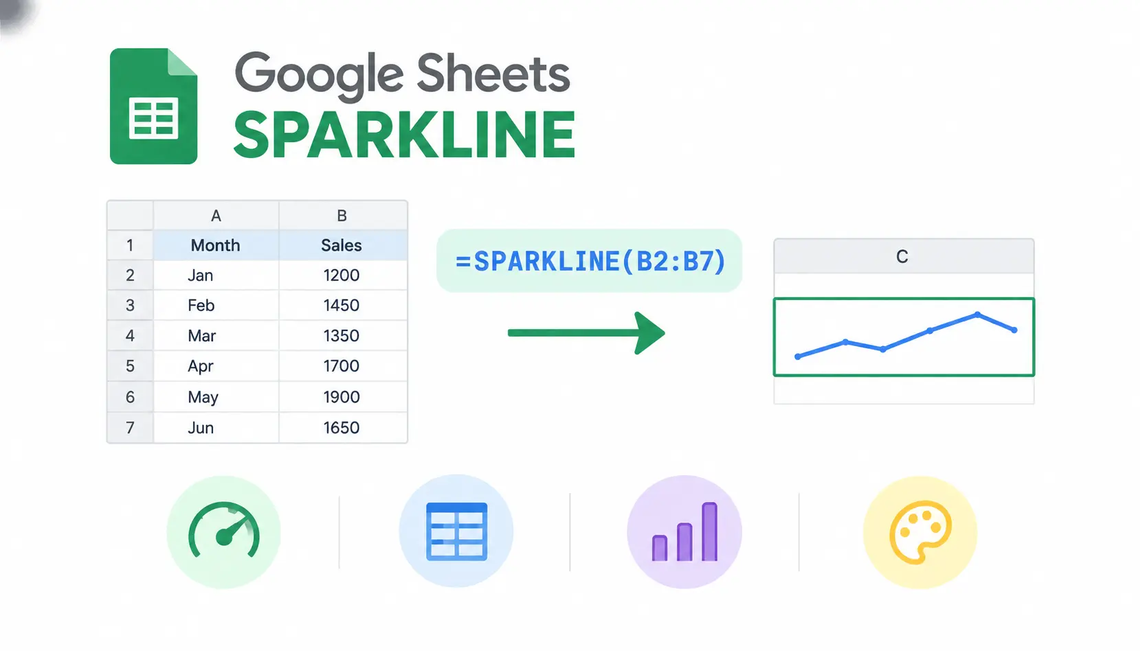
The function reads the numbers in the range you give it and draws them as a chart inside one cell. The chart has no title, legend, or labels. It only shows the shape of your data.
The sparkline stays linked to the source values. Change a number in the range, and the chart redraws itself. The cell size also matters: a wider, taller cell gives you a more readable chart.
Benefits of Using Sparklines
Sparklines earn their place in a sheet for a few practical reasons:
- Spot trends quickly. You see rising, falling, or flat patterns without reading every number.
- Save space. One cell replaces a chart that would otherwise cover several rows.
- Compare many rows. You can give every product, team, or region its own trend line.
- Summarize KPIs. A number plus a sparkline tells you where a metric is and where it has been.
- Build compact dashboards. Dozens of mini charts fit on one screen.
Sparklines vs. Regular Google Sheets Charts
Sparklines and regular charts solve different problems. Here is how they compare:
| Feature | Sparkline | Regular chart |
| Display location | Inside a single cell | Floats over the sheet or sits on its own |
| Space needed | Very little | A large block of cells |
| Data labels | None | Yes |
| Axes and legends | Optional axis only, no legend | Full axes and legends |
| Interactivity | None, no hover tooltips | Hover details and editing through the chart editor |
| Best use | Quick trends beside the numbers | Detailed analysis and presentation |
Use a sparkline when the shape matters more than the exact values. Use a regular chart when readers need to look up specific numbers.
How to Create a Sparkline in Google Sheets
The process takes about a minute. I’ll walk through it with a simple sales example.
Step 1: Prepare Your Data
Start with clean, organized data. Put your values in one continuous row or column with no stray text in between.
| A | B | |
| 1 | Month | Sales |
| 2 | January | 1200 |
| 3 | February | 1450 |
| 4 | March | 1350 |
| 5 | April | 1700 |
| 6 | May | 1900 |
| 7 | June | 1650 |
Consistent data keeps your formula simple and your chart accurate. Mixed formats and random gaps cause most sparkline problems later.
Step 2: Select an Empty Cell
Click the cell where you want the chart to appear, such as D2. The sparkline fills that cell, so choose one that holds no other data. Anything already in the cell will be replaced by the formula.
Step 3: Enter the SPARKLINE Formula
Type this formula:
=SPARKLINE(B2:B7)
The range B2:B7 is the data the chart will plot. Google Sheets reads the values from top to bottom and draws them from left to right.
Step 4: Press Enter and Review the Result
Press Enter. You should see a small line that climbs from January to May, then dips in June. That matches the numbers: sales peaked at 1900 in May and fell to 1650 in June.
Step 5: Adjust the Cell Size
The default cell is small, so the chart can look cramped. Drag the column border to make the column wider. Drag the row border to make the row taller.
A chart that looks flat or squashed often just needs more room. I usually set rows to about 40 pixels tall for dashboards.
Step 6: Copy the Formula to Other Rows
To build a sparkline for each row of data, copy the formula down. Google Sheets uses relative references, so the range shifts automatically. If you copy =SPARKLINE(B2:E2) from row 2 to row 3, it becomes =SPARKLINE(B3:E3).
Use the fill handle (the small square in the cell’s corner) and drag down. You don’t need to rewrite anything.
Understanding SPARKLINE Syntax and Arguments
The syntax is short, but the options argument has a few rules worth learning.
Basic SPARKLINE Syntax
=SPARKLINE(data, [options])
The first argument is required. The second is optional.
What Does the Data Argument Do?
The data argument tells the function which numbers to plot. It is usually a range like B2:B7. You can also pass an array of typed values, such as {3,5,2,8}.
Use numeric values. Text and errors can break the chart or get skipped, depending on your settings.
What Does the Options Argument Do?
The options argument lets you change how the chart looks and behaves. You can pick the chart type, change colors, set the scale, and control how empty cells are treated. If you leave it out, you get a default line chart.
How to Format SPARKLINE Options Correctly
Options go inside curly braces as option and value pairs. Here is a simple example:
=SPARKLINE(B2:B7, {“charttype”,”line”})
The name goes first, then the value. Names are text in quotation marks. To set more than one option, put a semicolon between each pair, so each pair sits on its own row of the array:
=SPARKLINE(B2:B7, {“charttype”,”column”;”color”,”green”})
Separators can vary by locale. In some regional settings, the comma inside the braces may need to be a backslash. If you get a parse error, check your spreadsheet’s locale under File > Settings.
Types of Sparklines in Google Sheets
Google Sheets supports four chart types. You choose one with the charttype option.
| Chart type | Purpose | Example |
| line | Show a trend over time (default) | =SPARKLINE(B2:B7) |
| column | Compare individual values | =SPARKLINE(B2:B7, {“charttype”,”column”}) |
| winloss | Show positive and negative results | =SPARKLINE(B2:B7, {“charttype”,”winloss”}) |
| bar | Show one value as a share of a total | =SPARKLINE({40,60}, {“charttype”,”bar”}) |
Line Sparklines
Line sparklines are the default. They work best for trends over time, like monthly revenue or daily traffic. A line that slopes up means the values are growing. A line that slopes down means they are shrinking.
=SPARKLINE(B2:B7)
For our sales data, the line rises through May and drops slightly in June.
Column Sparklines
Column sparklines draw one small vertical bar per value. They are better than lines when you want to compare individual periods, because each value stands on its own.
=SPARKLINE(B2:B7, {“charttype”,”column”})
They also support the most highlighting options, which I cover below.
Win/Loss Sparklines
Win/loss sparklines show whether each value is positive or negative. They don’t show size. Every positive value gets the same bar height, and every negative value gets a bar on the other side.
=SPARKLINE(B2:B7, {“charttype”,”winloss”})
Our sales data is all positive, so every bar would sit on the same side. This type fits better with data like monthly profit or loss, or game results marked as 1 and -1.
Bar Sparklines
A bar sparkline draws a single horizontal bar, or two stacked segments, inside the cell. It works like a tiny progress bar. It is different from line and column sparklines because it does not plot a series over time.
Here is an example that shows 70 percent of a target:
=SPARKLINE({70,30}, {“charttype”,”bar”;”color1″,”green”;”color2″,”lightgray”})
Bar sparklines use color1 and color2 for the two segments rather than the single color option.
How to Customize Sparklines in Google Sheets
One rule saves a lot of confusion: each option works only with certain chart types. Google lists the supported options for each type on its SPARKLINE help page. If an option seems to do nothing, check that first.
Change the Sparkline Color
Use the color option. You can enter a color name or a hex code.
=SPARKLINE(B2:B7, {“color”,”blue”})
A consistent color helps readers tell one metric from another. I use one color per metric and keep it the same across the whole sheet.
Change Line Width
The linewidth option sets the thickness of a line sparkline.
=SPARKLINE(B2:B7, {“linewidth”,2})
The default is 1. A value of 2 or 3 is easier to read in small cells. This option applies only to line sparklines.
Highlight the Highest Value
Line sparklines don’t have a built-in option to mark the peak. Column sparklines do, through highcolor. This colors the tallest column.
=SPARKLINE(B2:B7, {“charttype”,”column”;”color”,”lightgray”;”highcolor”,”green”})
In our sales data, the May column turns green while the others stay gray.
Highlight the Lowest Value
Use lowcolor the same way.
=SPARKLINE(B2:B7, {“charttype”,”column”;”color”,”lightgray”;”lowcolor”,”red”})
Here the January column turns red, since 1200 is the smallest value.
Customize Column Colors
Column and win/loss sparklines support several color options:
- highcolor colors the highest value.
- lowcolor colors the lowest value.
- firstcolor colors the first value.
- lastcolor colors the last value.
- negcolor colors negative values.
Here is a formula that marks the best month, the worst month, and the latest month:
=SPARKLINE(B2:B7, {“charttype”,”column”;”color”,”lightgray”;”highcolor”,”green”;”lowcolor”,”red”;”lastcolor”,”blue”})
Keep the palette small. Three or four colors is plenty.
Display an Axis
An axis is a horizontal line at zero. It helps most when your data has both positive and negative values. Turn it on with axis, and style it with axiscolor.
=SPARKLINE(B2:B7, {“charttype”,”column”;”axis”,true;”axiscolor”,”black”})
The axis option works with column and win/loss sparklines.
Control the Sparkline Scale
By default, each sparkline scales itself to its own data. You can override that with ymin and ymax for the vertical range, and xmin and xmax for the horizontal range.
=SPARKLINE(B2:B7, {“ymin”,0;”ymax”,2000})
This matters when you compare rows. If one product ranges from 10 to 20 and another from 1000 to 2000, auto-scaling makes both look equally dramatic. Fixing the same ymin and ymax for each row gives you an honest comparison.
Practical Google Sheets SPARKLINE Examples
These scenarios are the kind I build for clients most often. Each one pairs the chart with real numbers.
Example 1: Create a Monthly Sales Sparkline
Using the sales table from earlier, enter this in D2:
=SPARKLINE(B2:B7, {“linewidth”,2;”color”,”blue”})
The chart climbs from January (1200) to May (1900), then falls in June (1650). May is the highest month and January is the lowest. The sparkline tells you the story in a glance, and the table beside it gives you the exact figures.
Example 2: Create Sparklines for Multiple Products
Say you track four months of sales for several products:
| A | B | C | D | E | F | |
| 1 | Product | Jan | Feb | Mar | Apr | Trend |
| 2 | Notebook | 120 | 135 | 150 | 170 | |
| 3 | Pen set | 300 | 280 | 260 | 240 | |
| 4 | Folder | 90 | 95 | 90 | 100 |
In F2, enter:
=SPARKLINE(B2:E2)
Drag the formula down to F4. Notebooks trend up, pen sets trend down, and folders hold steady. You can see the winners and losers without reading a single number.
Example 3: Track Monthly Expenses
Place twelve months of expenses in a row, then add a column sparkline:
=SPARKLINE(B2:M2, {“charttype”,”column”;”highcolor”,”red”})
The tallest month turns red. Expenses that keep climbing deserve a closer look. A steady rise could point to a growing subscription, a price increase, or spending that has quietly crept up.
Example 4: Track Employee or Team KPIs
Suppose each team has weekly performance values, such as tickets resolved. Give each team a sparkline in the same column and use the same scale for all of them:
=SPARKLINE(B2:I2, {“ymin”,0;”ymax”,100})
The shared scale makes the teams directly comparable. Keep the actual numbers visible next to the charts. A trend line can hide the fact that a team fell from 95 to 60, which a manager needs to see.
Example 5: Create a Website Traffic Sparkline
Paste daily or weekly visitor counts from your analytics tool into a row, then add:
=SPARKLINE(B2:H2, {“color”,”purple”})
Sudden spikes and drops stand out immediately. Pair the chart with the total visitor count and the percentage change. The sparkline shows that something happened, and the numbers show how big it was.
Example 6: Create a Budget Performance Sparkline
Track actual spending by month against your budget:
=SPARKLINE(B2:G2, {“charttype”,”column”;”lastcolor”,”orange”})
The orange column highlights the most recent month. Use the chart to spot fluctuations, but don’t use it to replace your calculations. Variances, totals, and percentages still need formulas.
How to Create Dynamic Sparklines in Google Sheets
Make Sparklines Update When Data Changes
You don’t need to do anything special. A sparkline is a formula, so it recalculates whenever the referenced cells change. Edit a value, and the chart updates immediately.
Include New Data in a Sparkline
A fixed range like B2:B7 won’t pick up new rows. If you add July in B8, the chart stays the same until you edit the formula.
One simple fix is an open-ended range:
=SPARKLINE(B2:B)
This includes every row below B2. Empty cells at the bottom can leave blank space on the chart, so you may want to control how blanks are handled with the empty option.
A cleaner approach ends the range at the last filled cell:
=SPARKLINE(B2:INDEX(B2:B, COUNTA(B2:B)))
This builds a range from B2 to the last non-empty value, so the chart grows as you add data. It assumes there are no gaps in column B.
Use SPARKLINE With Other Functions
A few combinations solve real problems:
- FILTER removes blanks or limits the data. For example, =SPARKLINE(FILTER(B2:B, B2:B<>””)) ignores empty cells.
- INDEX and MATCH pull a row by name. If G1 holds a product name, =SPARKLINE(INDEX(B2:E4, MATCH(G1, A2:A4, 0), 0)) charts that product’s row. This is handy for interactive dashboards with a dropdown.
- IFERROR hides errors from missing data: =IFERROR(SPARKLINE(B2:E2), “No data”).
ARRAYFORMULA is more limited. It doesn’t produce a separate sparkline for each row from a single formula, so copying the formula down is usually the simpler route. You can also use the Excel SUM shortcut to calculate totals quickly before displaying trends with sparklines.
When to Avoid Complex Dynamic Formulas
Nested formulas are harder to audit. If a colleague opens your sheet in six months, they need to understand it quickly. When a fixed range does the job, use it.
Save the dynamic versions for sheets where data really does grow often. Simple formulas are easier to maintain and they recalculate faster.
Common Google Sheets SPARKLINE Errors and How to Fix Them
Here is a quick reference for the most common problems:
| Problem | Likely cause | Fix |
| Formula returns an error | Syntax or option typo | Check quotes, commas, and braces |
| Sparkline is blank | Empty or non-numeric range | Confirm the range holds numbers |
| Colors don’t change | Option not supported by the chart type | Match the option to the chart type |
| Chart looks flat | Outliers or mismatched scale | Set ymin and ymax |
| Blank cells distort the chart | Gaps in data | Use the empty option |
| Text breaks the chart | Non-numeric values | Use the nan option or clean the data |
| New rows are missing | Fixed range | Extend the range |
| Parse error on options | Locale separators | Check your locale settings |
SPARKLINE Formula Returns an Error
Start with the basics. Check that every option name is in quotation marks, that each pair has a name and a value, and that curly braces are balanced. Also confirm the range reference is valid. A single missing quote is the most common cause.
Sparkline Appears Blank
Look at the cells you referenced. If they are empty, formatted as text, or contain only errors, there’s nothing to draw. Numbers stored as text are a frequent culprit. Retype one value and see if the chart appears.
Sparkline Colors Do Not Change
This usually means the option doesn’t apply to the chart type you chose. For example, highcolor works with column and win/loss sparklines, but not with line sparklines. Switch the chart type or use a supported option.
Negative Values Are Difficult to Interpret
A line sparkline can make negative values hard to read. Switch to a column or win/loss chart. Then add negcolor to color the negative values and turn on axis so the zero line is visible.
=SPARKLINE(B2:B7, {“charttype”,”column”;”negcolor”,”red”;”axis”,true})
Sparkline Looks Flat
A flat line often means one value is much larger than the rest, so everything else looks tiny. It can also happen when the chart is auto-scaled to a very wide range. Set ymin and ymax to a tighter range, or check your data for an outlier.
Blank Cells Create Unexpected Results
Use the empty option to control the behavior. Setting it to “zero” treats blanks as zero. Setting it to “ignore” skips them, which is the default.
=SPARKLINE(B2:B7, {“empty”,”zero”})
Pick the option that matches what a blank actually means in your data.
Text Values Cause Unexpected Results
The nan option controls how non-numeric values are handled. Use “convert” to treat them as zero, or “ignore” to skip them. It’s a useful safety net, but cleaning the data is a better long-term fix.
Formula Stops Including New Rows
This happens with fixed ranges. Edit the formula to include the new rows, or switch to an open-ended range or the INDEX and COUNTA approach from earlier.
Formula Separators Cause Errors
Sheets use different separators depending on locale. If your formula looks right but still errors, change your spreadsheet locale under File > Settings, or adjust the separators to match your region. Copying a formula from a US-based tutorial into a sheet set to another region is the usual trigger.
If you’re stuck, communities likegooglesheets on Reddit are a good place to ask. Post your formula and a sample of your data to get faster answers.
How to Use Sparklines in a Google Sheets Dashboard
Build a Simple KPI Dashboard
A basic dashboard row has five parts:
- The metric name.
- The current value.
- A sparkline showing the recent trend.
- The target.
- A change indicator, such as the percent difference from last month.
For example, put “Revenue” in A2, the latest figure in B2, the target in C2, and a sparkline in D2. Then add a formula in E2 for the change. Repeat for each KPI.
Use Sparklines to Compare Performance
Stack sparklines in one column to compare products, teams, or periods. Because they sit next to each other, differences stand out right away. Use the same scale for every row, so the comparison is fair.
Improve Dashboard Readability
A few habits keep dashboards clean:
- Keep chart sizes consistent.
- Use meaningful labels in the neighboring cells.
- Avoid excessive colors.
- Keep exact values accessible.
- Apply consistent scales where comparisons matter.
Understand Sparkline Limitations
Sparklines can’t show data labels, legends, or hover details. They also plot one series at a time. If readers need precise values, multiple clearly separated series, or deeper detail, use a regular chart instead.
Google Sheets SPARKLINE Best Practices
Keep the Source Data Organized
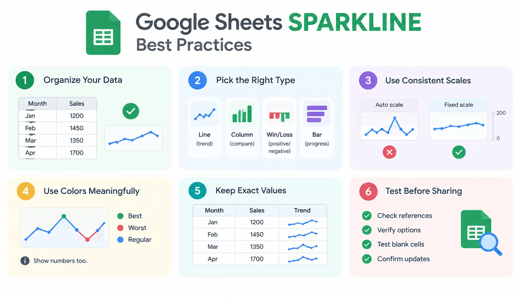
Clean, consistent data produces reliable charts. Use one row or column per series, avoid mixed formats, and keep headers outside the plotted range.
Choose the Right Chart Type
Match the chart to the question. Use lines for trends, columns for comparing periods, win/loss for positive versus negative outcomes, and bars for progress toward a goal.
Use Consistent Scales for Comparisons
Independent scaling can make small changes look huge. When you compare rows, fix ymin and ymax so every chart uses the same range.
Use Colors Meaningfully
Assign each color a job, such as green for the best value and red for the worst. Don’t rely on color alone. Some readers have color vision differences, so keep the numbers nearby.
Keep Exact Values Available
A sparkline is a summary, not a replacement for data. Always show the underlying numbers somewhere in the sheet.
Test Formulas Before Sharing
Before you send a sheet to others, check the references, test the options, and see how the chart behaves with blank cells. Change a value or two to confirm the chart updates as expected.
Frequently Asked Questions About Google Sheets SPARKLINE
1. What Is the SPARKLINE Formula in Google Sheets?
The syntax is =SPARKLINE(data, [options]). The first argument is the range of values to plot. The second, optional argument is an array of settings such as chart type and color.
2. How Do I Change a Sparkline’s Color?
Add the color option: =SPARKLINE(B2:B7, {“color”,”red”}). You can use color names or hex codes.
3. Can Google Sheets Sparklines Show Negative Values?
Yes. Column and win/loss sparklines handle negative values well. Use negcolor to color them and axis to show the zero line.
4. How Do I Create a Sparkline for Every Row?
Write the formula in the first row, such as =SPARKLINE(B2:E2), then drag it down. Relative references adjust automatically for each row.
5. Can I Use SPARKLINE With ARRAYFORMULA?
Not in a way that creates a separate sparkline for every row. Copying the formula down is simpler and more reliable.
6. Why Is My SPARKLINE Formula Not Working?
Check five things: the syntax, the range, the option and value pairs, whether the option fits the chart type, and your locale’s separators. Also confirm that the source cells hold real numbers.
7. Can I Use Sparklines in Google Sheets Dashboards?
Yes. They work well beside KPI values, targets, and tables. Use full charts when you need more detail.
8. What Is the Difference Between a Sparkline and a Regular Chart?
A sparkline is a tiny, label-free chart inside one cell. A regular chart is larger and includes axes, legends, and interactive details. Use sparklines for quick trends and regular charts for in-depth analysis.
Conclusion
The Google Sheets SPARKLINE function is one of the easiest ways to make a spreadsheet more readable. Start with =SPARKLINE(B2:B7), then add options for chart type, color, and scale as you need them.
Remember the key habits: match the chart type to your question, use consistent scales when comparing rows, and keep the exact numbers visible. For more detail, check Google’s official SPARKLINE documentation before using any option you haven’t tried.