
Leading a shared React component library for five distinct product teams means spending way too much time policing interface assets. Visual consistency degrades rapidly without strict governance. One group imports thin, wispy outlines for their menus. Another dev grabs random PNG files from Google images. A third team insists on heavy, filled legacy font icons. Every sprint review feels like a visual car crash.
Maintaining coherence across a sprawling enterprise application takes a massive, unified icon set. Relying entirely on an overloaded in-house design team to draw thousands of states and edge-case metaphors guarantees a bottleneck. We migrated our workflow to Icons8 Icons to solve that exact scaling issue. Now we standardize our visual language without waiting weeks for custom asset delivery.
Evaluating the Ecosystem of Interface Assets
Evaluating asset sources for a large component library usually presents three inadequate options. Building an in-house set feels incredibly cohesive, but it moves agonizingly slow. Internal teams might build 200 core graphics. But they will inevitably miss highly specific metaphors required by niche administrative dashboards. Design teams just can’t keep up with sprint velocities.
Open source packs like Feather or Heroicons look beautiful. Developers love how optimized they are for code. Unfortunately, they max out at a couple thousand files. Hit a wall immediately when a product manager requests something weird like a localized payment gateway or an obscure hardware peripheral.
Aggregator services like Noun Project or Flaticon solve volume constraints but fail at cohesion. Millions of files from thousands of independent authors live on those platforms. Mixing and matching them creates absolute garbage. You end up with clashing grid systems, varying stroke weights, and mismatched corner radii. Your app starts looking like a ransom note.
Icons8 fixes that mess by organizing over 1.4 million assets into strict visual styles. Popular families like iOS 17 or Windows 11 pack over 10,000 icons each. Finding a matching file suddenly takes seconds instead of hours.
Escaping the Friday Morning Feature Flag
Late last Thursday afternoon brought a classic emergency. Analytics realized they lacked a specific empty state graphic for a new reporting dashboard shipping next morning. Filing a ticket wasn’t an option. Waiting for design routing wasn’t happening either. My dashboard needed an asset that perfectly matched our system immediately. The deadline was completely non-negotiable.
Opening the Icons8 web application took seconds. Finding our standard iOS 17 Outline graphic for a database happened instantly. Clicking into the in-browser editor bypassed external software entirely. No downloading bulky desktop apps required.
Next, I scaled the padding to adjust canvas size. Adding a small circular subicon to the bottom right corner took one click. Applying our brand red HEX code to that stroke created an instant error state.
Dropping the downloaded SVG directly into our React wrapper finished the job. That fix took three minutes. Best of all, that new SVG perfectly matched our existing interface styling. Nobody even realized it wasn’t custom-made by our design team.
Standardizing the Core Component Library
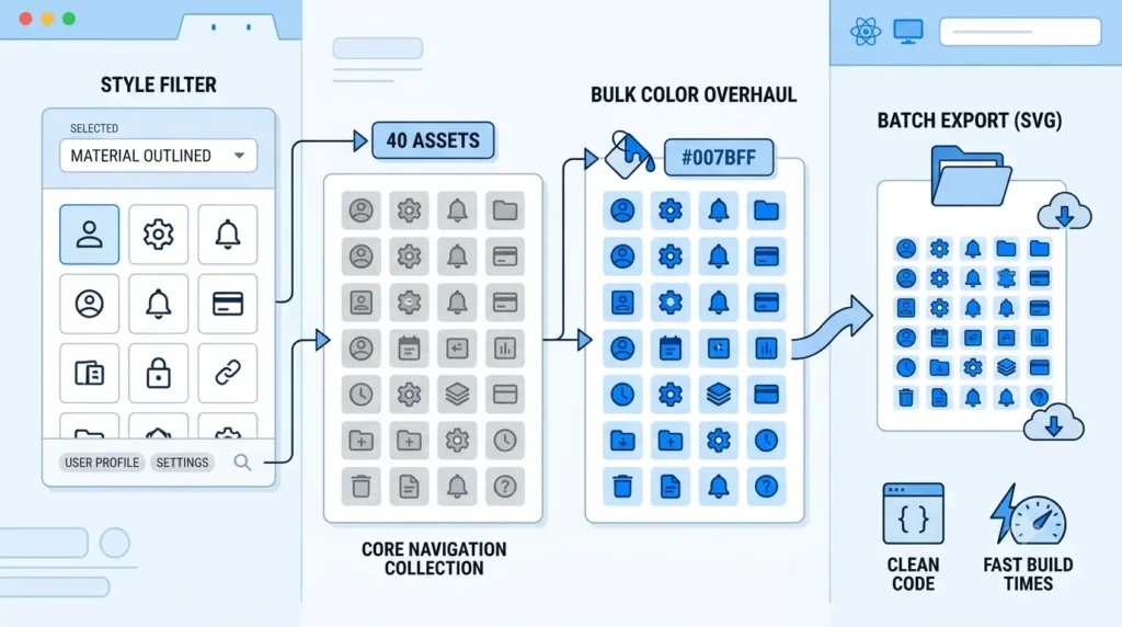
Overhauling our primary navigation component required 40 different graphics in exact matching styles. Building a cohesive rollout takes serious coordination. Batch processing inside Icons8 handles foundational work like a dream.
My process started with the Styles menu. Filtering the entire library exclusively for Material Outlined removed all visual noise. Text search quickly surfaced variations for user profiles, settings, notifications, and billing modules. Dragging exact matches into a custom “Core Navigation” collection kept everything organized.
Hitting 40 assets triggered the next phase. Editing each file individually sounds awful, so I didn’t do it. Applying our primary interface HEX code to every asset simultaneously worked flawlessly via the bulk recolor tool. One click updated the entire collection instantly.
Exporting the entire batch as SVGs wrapped up the task. Choosing the simplified download setting strips out unnecessary XML junk automatically. Your React components stay perfectly lightweight. Build times remain incredibly fast.
Managing Legacy Metaphors and Specific Imports
Product teams sometimes demand highly specific visual metaphors to maintain continuity with legacy systems. Refactoring an old admin portal recently proved this point. One squad needed a specific computer icon matching an older desktop software graphic their users already recognized. Breaking that visual habit would cause endless customer support tickets.
Guessing search terms wastes time. Uploading a screenshot of the legacy asset into the image search feature works much better. It immediately located the closest structural match within our chosen Windows 11 Color style pack. The AI recognized the shape instantly.
Unchecking the default “simplified” setting before downloading preserved the editable vector paths. Opening that file in Lunacy let me slightly modify one bezier curve before committing the change to our repository. Fine-tuning vector nodes gave us absolute control over the final render.
Where the System Falls Short
Having millions of files doesn’t make Icons8 a universal solution for every product requirement. Sometimes a stock library just won’t cut it.
Projects demanding a strictly free tier will likely face serious frustration here. Free plans restrict downloads to 100px PNG files and demand strict attribution. Modern frontend development requires resolution-independent SVGs, making a paid subscription mandatory. Bootstrapped startups might need to look elsewhere.
Brand identities relying on highly abstract, proprietary visual metaphors also hit roadblocks. Stock libraries simply can’t predict unique corporate concepts without real-world equivalents. Representing a proprietary machine learning algorithm unique to your company still requires an in-house designer to craft that bespoke asset. Generic metaphors will confuse your users in these edge cases.
Tactical Implementation Practices
Working with a massive, centralized asset library requires discipline to prevent a sprawling codebase. Without ground rules, developers will ruin your component architecture. Try these proven tactics:
- Commit to a single style family across your entire application. Doing so guarantees strict stroke weight and corner radius consistency.
- Grab CDN embed links or Base64 HTML fragments for rapid prototyping environments. Always download physical SVGs for production builds to reduce external network requests.
- Keep simplified SVG settings enabled for standard interface graphics. Stripping out extra data drastically reduces node counts and keeps component bundles small.
- Test the dark and light background toggle in the preview pane before finalizing any download. Confirming contrast for both color modes prevents accessibility nightmares later.
- Store custom collections inside shared team accounts. Centralized folders stop developers from duplicating efforts when building new feature branches.